The Brief
To re-brand a village pub to help attract potential new customers and boost sales.
The Red Lion is a village pub located in Sundon Village, beds, It was sadly closed for more than 3 years before it re-opened. It re-opened in the middle of 2013 with a owner and staff that had the inspiration and motivation to create it more successful as it once was.
The Red Lion is our local pub and we saw it as not just our mission but our duty to help it succeed in the future, this is where we proposed to give it an identity that was easily recognisable as a friendly traditional English pub.
Client:The Red Lion
Date:29th, June, 2014
Type:Branding
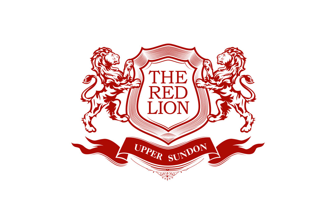
Branding

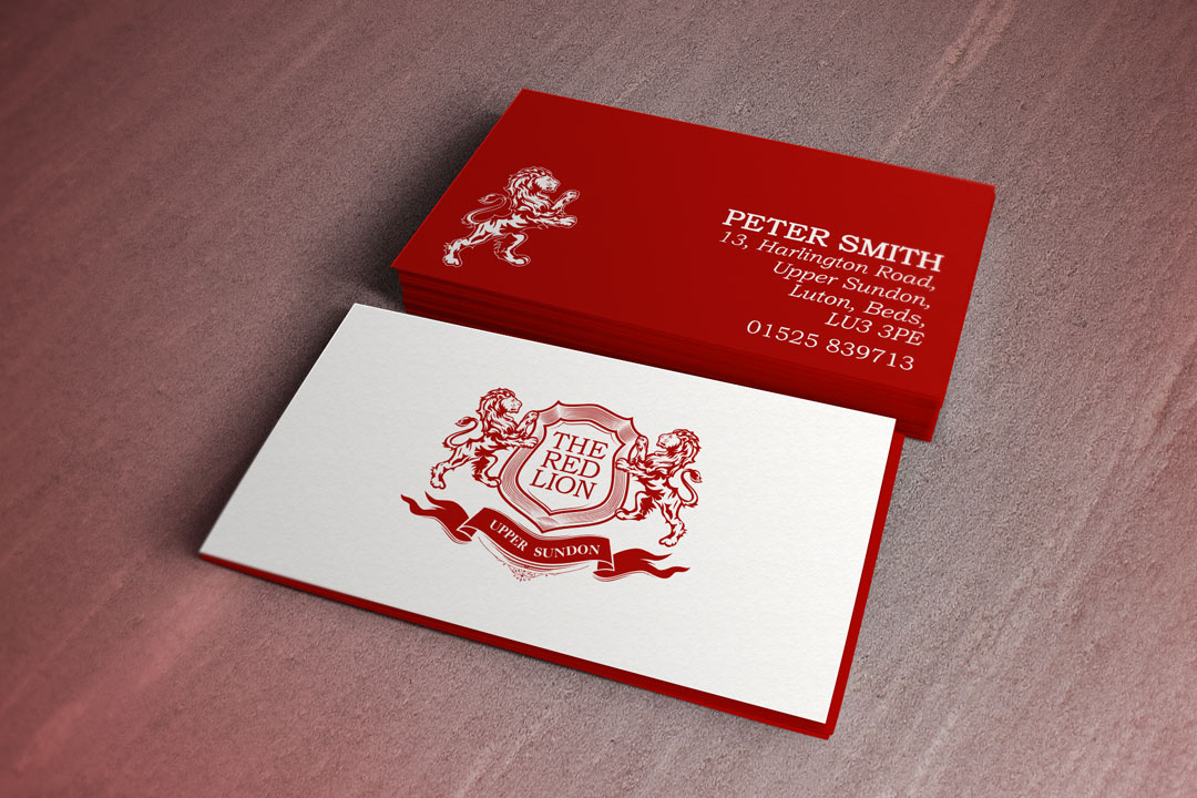
Business Cards

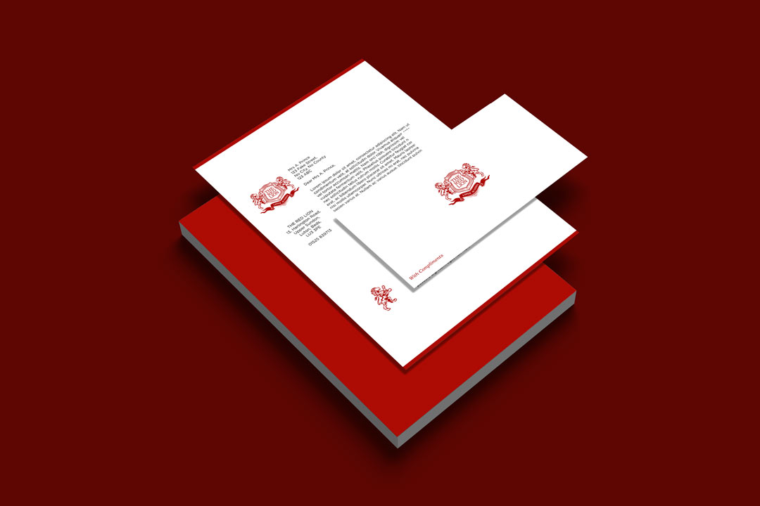
Letterhead & Compliment Slip

Typography
Athelas was used due to it's traditional and romanesque style that tied in perfectly with the illustration style of the branding.
To purchase Athelas, please click here

Athelas: Regular Colours: #AD0B04, #FFFFFF
The Design Process
-
Step 1.
Contact with the Client
We first made contact with the owners of The Red Lion when they re-opened the small village pub in mid-August 2013. We introduced ourselves and later explained how much we would love to help them out with any design related work. They later came back and asked if we could create them an identity along with a business stationary set.
-
Step 2.
Receiving the Brief
They asked if we could create the logo as traditional as possible while adding a modern twist while including lion(s) and a shield. Originally they required "pub & kitchen" to be added but wasn't sure when they'll start using the pub kitchen so they changed their mind to 'Upper Sundon'.
-
Step 3.
Research and Idea Generation
The Red Lion or Red Lion is the most popular British pub name so we had some competition in terms of designing a logo. We couldn't design it similar to others as it wouldn't stand out and with our research, we found that most logos are set in a traditional style. That's when we realised that this is going to be a tough project.
Firstly we started illustrator lions in a perspective that would work around a shield, the idea was to have a lion either side of a shield with the wording "The Red Lion" placed centrally within the shield. We hadn't decided on colours, the obvious red was an option but we also tried gold and black and while using all 3. -
Step 4.
Client Review
We sent 4 variations of ideas all in different colours, red, gold, black and a mix of all three. They couldn't decide whether the red or the gold was the strongest but after a few days to think it over, they decided to go with the red but however the gold would be used as a secondary colour in other materials.
-
Step 5.
Revised Ideas
The only feedback we received was to change the shape of the shield as they felt it was too narrow and needed to be opened up as it didn't leave the 'The Red Lion' text enough room to become a separate element. We made the change and went to show them where we got an approval straight away.
-
Step 6.
Business Cards, Letterheads & Compliment Slips.
After the logo was approved, it went straight to the sign makers where two signs were produced, the logo to go on the front of the pub and the name of the pub on the right-hand side to attract passers-by. We were then asked to produce and print business cards, letterheads and compliment slips. We kept it very minimal while adding a modern twist.
Completed In
1
Hours
Weekly Returning Customers
120+
Since New Branding
Facebook Likes
1250+
Since New Branding
Client Review
"When I required artwork for a new branding, I knew I needed a creative design agency on the same wavelength as myself. 2Corners was the best choice. They took the time to discuss the brief and delve deeper into my final expectations. They quickly followed up our initial meeting with an array of outstanding examples by providing multiple artworks, they had allowed me to make a faster decision and proceed promptly in producing the signage. I was thankful That I found 2Corners." Peter Smith - The Red Lion
Show Some Love & Share
Let's Talk
We would love to work with you on your design project. Let’s talk about working together.
Call Us
We would love to talk to you. Give us a call on: +44(0) 7597 137172
Email Us
If you'd like to send us an email, our address is: hello@2corners.net


