The Brief
To design a brand for an Australian Carpentry business to help boost their clientele.
M D Carpentry was recommended to us by a returning client. They are a carpentry business based in Queensland, Australia who focus on a range of areas from fitting door frames to home improvements.
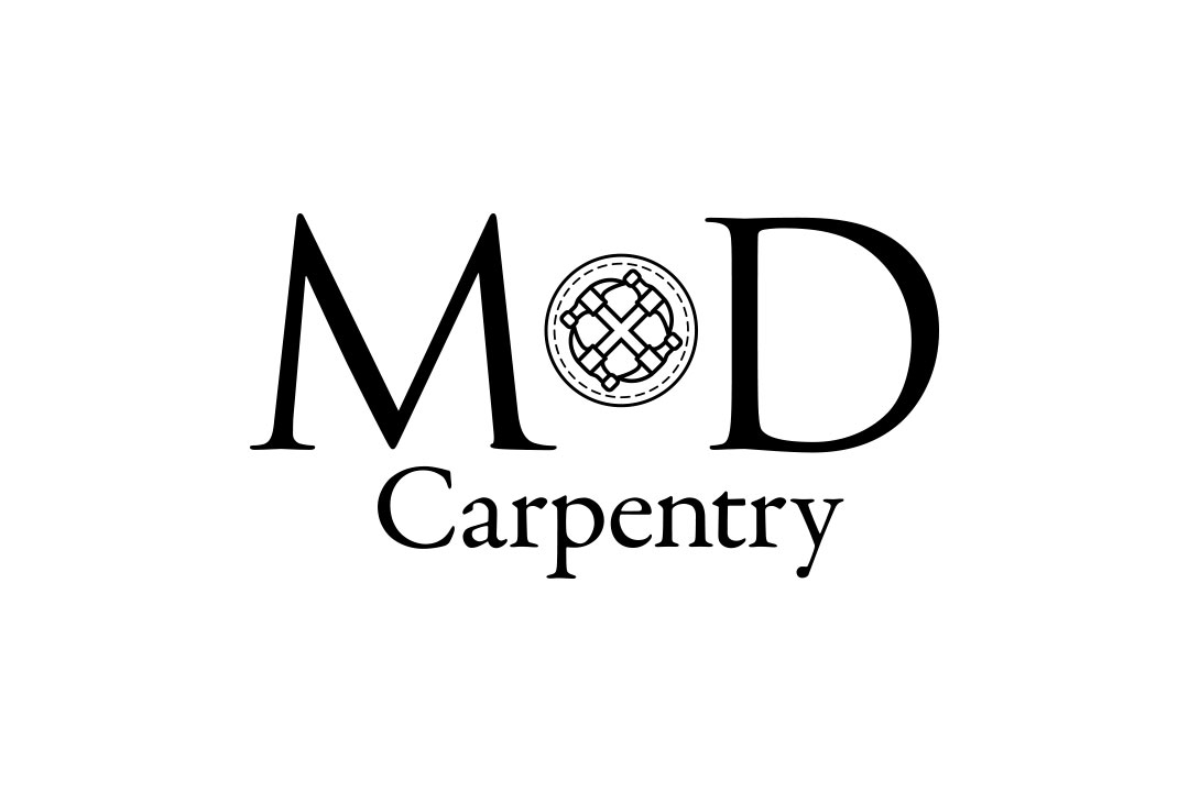
They required a logo that had a professional feel yet representative of the industry they are in as it was very important to them to be as easily recognisable of what their industry their business is in from a distance.
Client:M D Carpentry
Date:15th, April, 2016
Type:Branding & Identity
Branding

Business Cards

Letterhead

Typography
Garamond was the best option to add the professional feel and legible approach that was required.
To Download Garamond, please click here

Garamond: Regular Colours: #000000,
The Design Process
-
Step 1.
Contact with the Client
Due to M D being located in Australia, Speaking to them either by a phone or Skype call was limited due to the different time zones so an email conversation was logical even though the time zones added hours to get replies. When speaking to them we found they have a huge amount of inspiration and motivation to boost their client list and their business.
-
Step 2.
Receiving the Brief
We were tasked to design their new logo that had a professional feel yet representative of the industry they're in as it was very important to be easily recognisable of what their business does from a distance.
-
Step 3.
Research and Idea Generation
With what we gathered in terms of requirements, we set out to research the industry, competitors within their region, colour schemes and possible font styles. We found that most competitors have either designed their own logo using plain text while others stuck to the same style as one another.
With all of this information, we generated 5 ideas that are completely different to the competitors by using different font styles, no obvious elements e.g. hammers, saws and other tools and we used a variety of colours that both represented the industry plus adding a professional feel. -
Step 4.
Client Review
M D found it hard to decide on what option to go for, when they final did, they asked if we could merge two ideas together e.g. changing the font style from one idea to another. They also asked to add in a hammer element but subtly so it will not be too over distractive.
-
Step 5.
Revised Ideas
We set out to design a hammer illustration that both looked professional and fitting to the font style. We decided to place this element between the 'M' and the 'D' to help split the two letters but also to help aid the eye to see it first. We emailed the final design where it got an approval to add it to business cards and a letterhead design.
-
Step 6.
Business Cards & Flyers
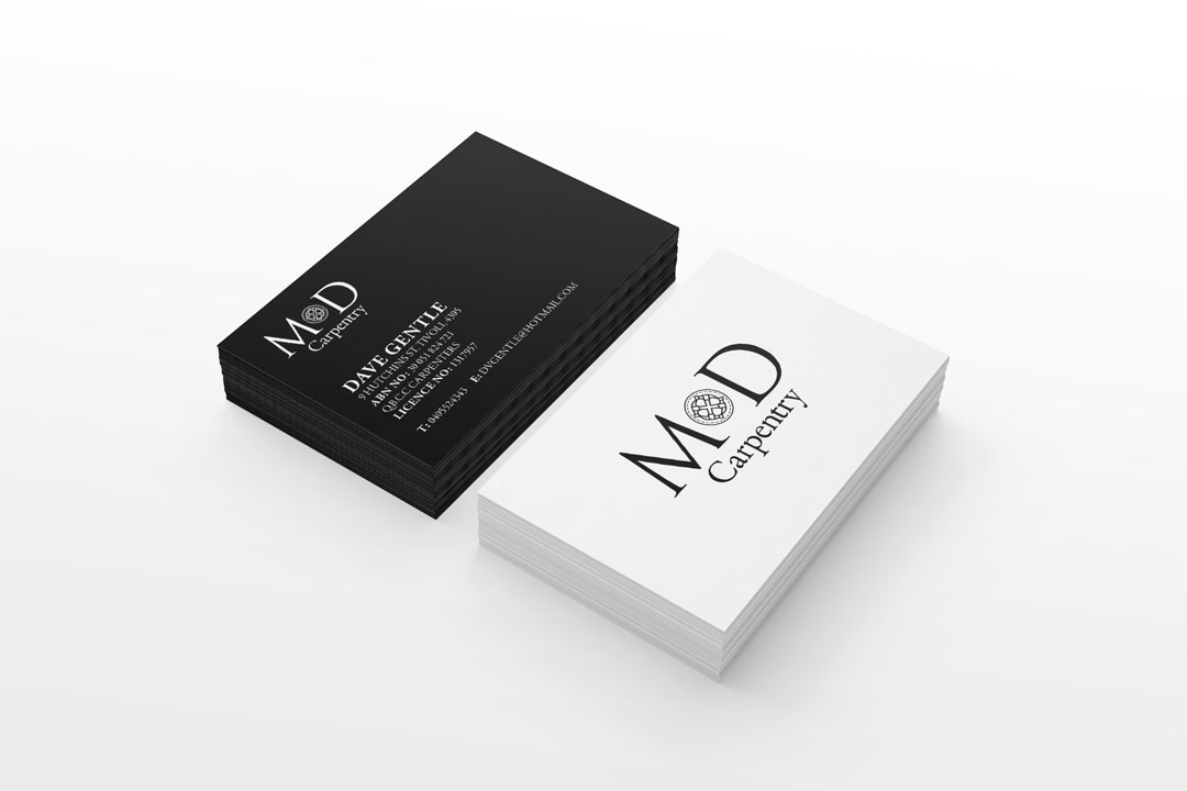
Once the logo was approved, we designed a potential layout for a set of business cards where one side had the logo centred on a white background while the other side was solid black with their contact details in the bottom left corner with the logo in white placed on the top left corner.
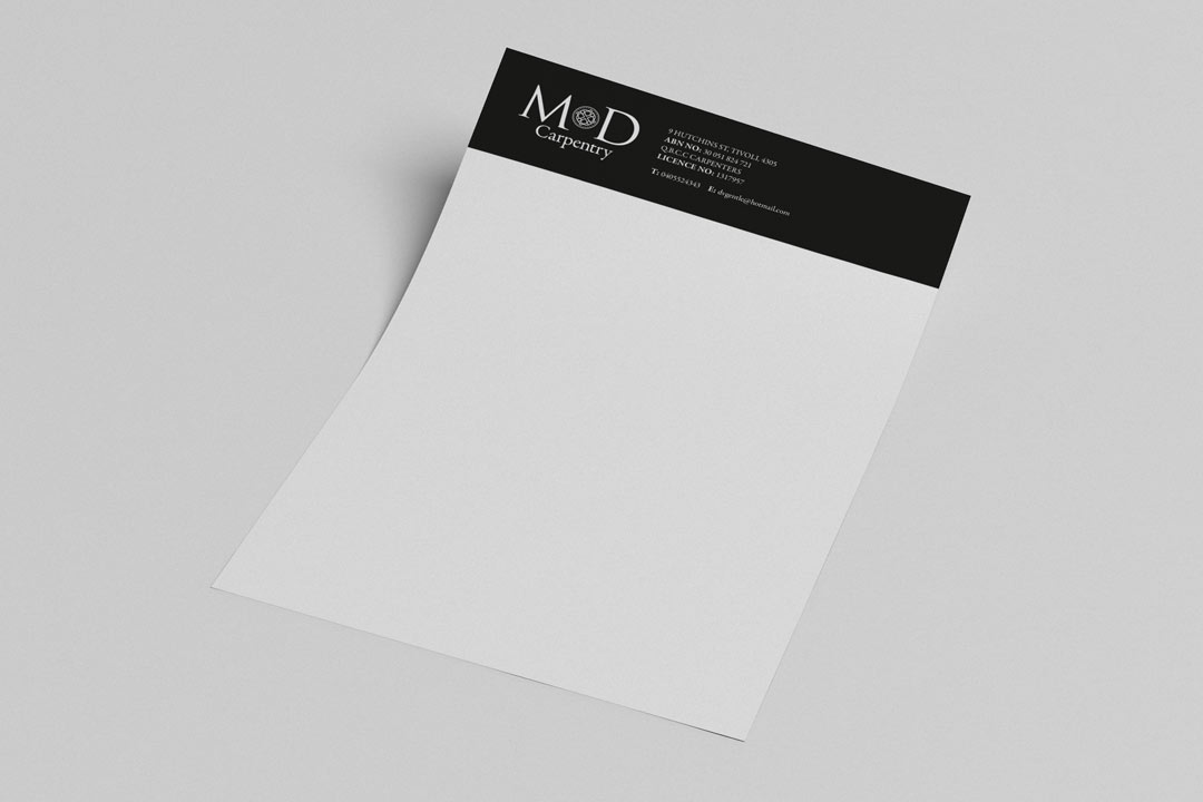
We then designed a letterhead template where they would be used for contacting customers or for physical invoices. We kept the style the same as the business cards to keep consistency where it has a black bar running from the top from both sides with the white logo placed towards the top left corner while the contact information sits next to it.
Completed In
1
Hours
Jobs completed
150+
Since New Branding
Return Customers
10+
Since New Branding
Show Some Love & Share
Let's Talk
We would love to work with you on your design project. Let’s talk about working together.
Call Us
We would love to talk to you. Give us a call on: +44(0) 7597 137172
Email Us
If you'd like to send us an email, our address is: hello@2corners.net


