The Brief
To create an identity and website that is seperate from any potential competitor but also engages with both adults and children alike.
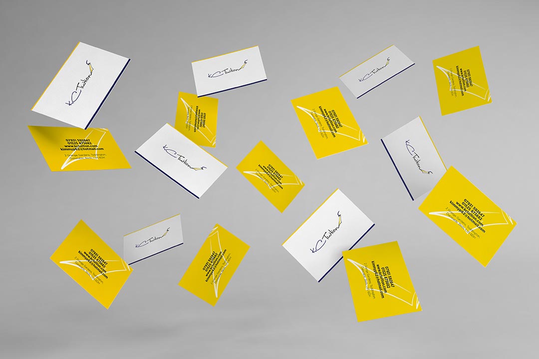
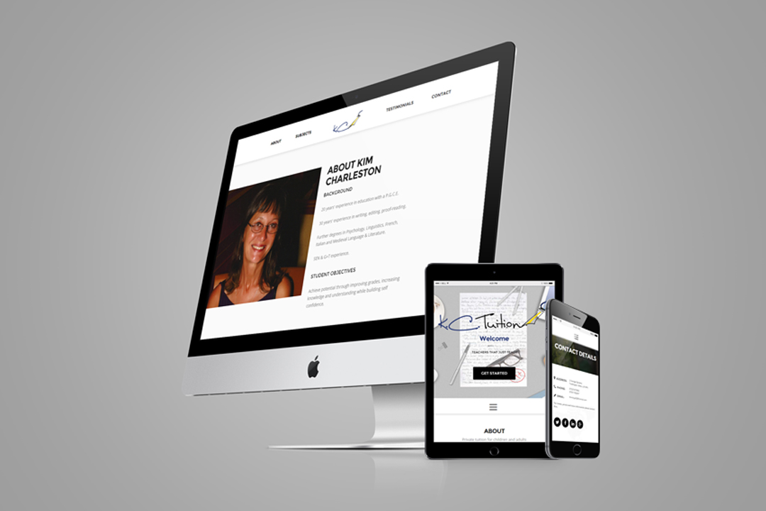
K.C. Tuition is a private tutor specialising in many education areas, they came to us for a brand identity, business card design and a single page website that would help boost their clientele along with shining out any competitors in their area. The brief was simple, use navy & yellow colours and keep the branding simple, modern and effective.
We created several ideas for the branding but the reason why this one was chosen was simply because both the signature and pen nib work together to create a personal but also sophisticated feel. Only a touch of blue was used to give a professional feel while the touch of yellow was a more representation of a relaxed working environment.
Client:K.C. Tuition
Date:25th, Sept, 2014
Type:Branding & Web Design
Site:kctuition.com
Branding

Business Cards

Website

Typography
Luna Bar was chosen for it's personal and professional feel it creates and works in any size. Luna bar also helps the pen nib and in splatters work without them looking out of place.
To purchase Luna Bar, please click here

Luna Bar: Regular Colours: #FBD703, #243671
The Design Process
-
Step 1.
Meeting the Client
Before getting an idea off what was installed for the project, we first met up with the owner of K.C. Tuition personally. This allowed us to get a more understanding of herself and the company she's created. By doing this, it would help later on during the design process.
-
Step 2.
Receiving the Brief
While Sitting down with K.C. Tuition and receiving the brief, it gave us a perfect opportunity to discuss ideas, the market and any potential competitors. We took what we gathered and applied it to our research and idea generation.
-
Step 3.
Research and Idea Generation
With what we gathered from our metting, we went out to research any relevant local businesses, colour themes, possible branding ideas and possible website layouts. After piling our research into mood boards we started to approach various branding ideas where K.C. Tuition would pick a potential that we would later revise.
-
Step 4.
Client Review
We sent K.C. Tuition various ideas to Chose upon, the majority were in a signature style while the others were more corporate. The feedback was both uplifting and directive. They knew exactly what they wanted and explained it so well that we envisioned their revised idea exactly how they did.
-
Step 5.
Revised Ideas
After receiving feedback, we set out to amend the final idea. The signature approach was a green light but with some added simple features which included a illustrated pen nib and ink splodges. Once the logo was approved, our next step was to start laying out their website. Like the logo, we kept the overall site simple where we created it as a one page website so that everything is easily accessible.
-
Step 6.
Launch
With the logo and website approved, it's time to launch the website & Facebook page. Since the end of September 2014, K.C. Tuition has out shunned any competitors in their local area and improved their client numbers. With our help, they haven't stopped growing in success and as a company.
Completed In
0
Hours
Weekly Website Views
20+
Since Launch
New Clients
10+
Since Launch
Client Review
“2Corners designed and created a website and business stationery for K.C. Tuition Services in 2014. I was delighted by the end-product and impressed by their skill, creativity and attention to details. After careful research 2Corners also made useful suggestions which enhanced and complemented my needs and preferences. I would not hesitate to recommend 2Corners to anyone who wants to create a new and original website and related products or who wants to simply up-date their existing one." Kim Charleston - Owner
Show Some Love & Share
Let's Talk
We would love to work with you on your design project. Let’s talk about working together.
Call Us
We would love to talk to you. Give us a call on: +44(0) 7597 137172
Email Us
If you'd like to send us an email, our address is: hello@2corners.net


