The Brief
To re-brand a health & wellness website to a more simpler approach.
Daily Zen approached us with a required re-brand for their health & wellness website. Their current logo contained a monk icon with the company name underneath. They wanted something more simpler to reflect on their website and the posts they publish.
They still required the orange to be used to represent an orange Buddhist monastic robe while adding a lighter tint of black to work with the orange. Later they asked us to produce numerous materials such as web banners & labels for products.
Client:Daily Zen
Date:13th, February, 2016
Type:Branding
Site:www.dailyzen.co.uk
Branding

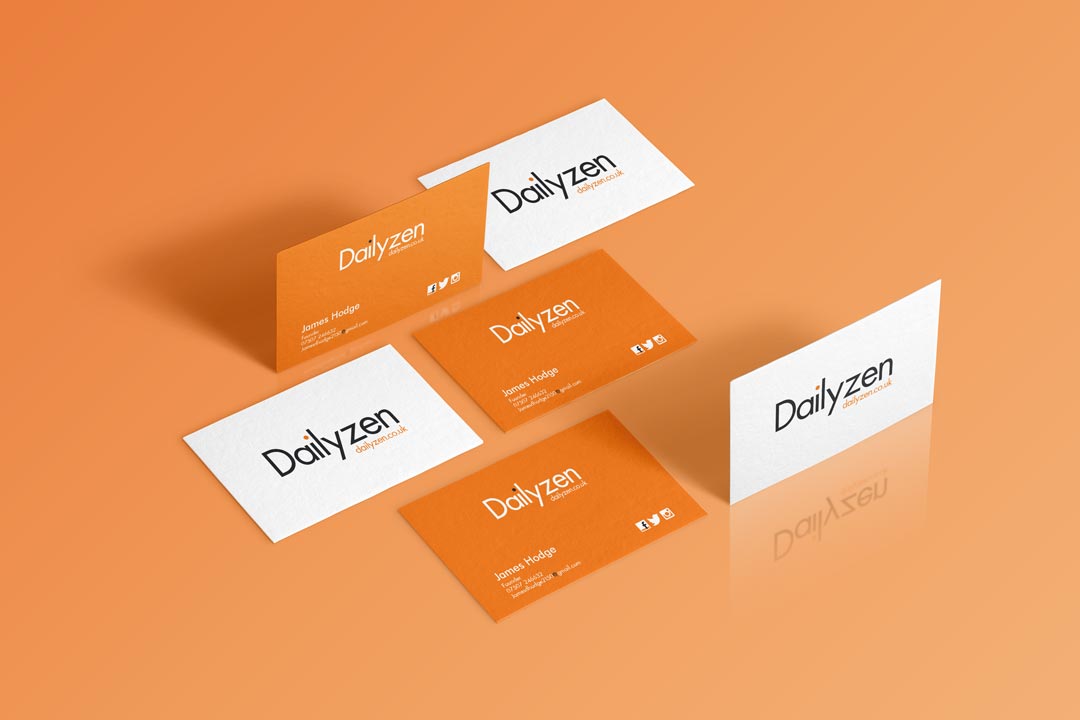
Business Cards

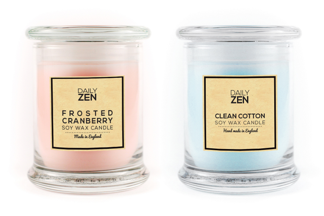
Product Labels

Typography
Futura was used for its simple and geometric appearance that Daily Zen was looking for. The colours used were to symbolise Buddhist monks.
To purchase Futura, please click here

Futura: Medium Colours: #3A3A3A, #F07E1A
The Design Process
-
Step 1.
Contact with the Client
We met with Daily Zen when a previous clients recommend us to them. We sat down and gathered knowledge off both their business and their future prospects. They wanted their logo to be re-designed as they felt their current logo wasn't working for them. They wanted it to be simple, professional and representative of their business.
-
Step 2.
Receiving the Brief
While gathering key elements from their brief and their business structure, we had the chance to throw in a few examples of what they could do with the branding e.g. replace the dot from the "i" to something representative to a special occasion like a heart for valentines day or a snowflake for christmas. They loved the idea and still use it to this day.
-
Step 3.
Research and Idea Generation
We set out to research over websites and facebook pages to get an understanding of their audience and how they're approached their artwork. We found that most tend to use either a scripted or hand written font. That gave us the definitive answer to how we're going to design the logo. We used a geometric and professional looking font where we changed the colour of the dot from the "i" to the requested orange.
-
Step 4.
Client Review
We sent the logo ideas for any changes or an approval. Daily Zen loved the idea of using the geometric font, it was exactly what they were after. It added simplicity, a proffesional feel and it was different to what others were using. The only feedback was to lighten the black and bring the letters closer together.
-
Step 5.
Revised Ideas
We added the required changes and sent the logo back for an approval. Once got an approval, we started to create the Facebook header and profile photos while creating a web friendly version for their website along with a web banner that would be placed on their website.
-
Step 6.
Business Cards & Product Label
After the Facebook images and web friendly logo was successfully uploaded. We started to design and print their business cards. The business cards were printed on a thick card (400gsm) with a glossy finish. We then designed and printed candle labels that would be placed on their range of handmade scented candles.
Completed In
1
Hours
Facebook Likes
56950+
Since New Branding
Daily Website Views
200+
Since New Branding
Client Review
“We have worked with 2 Corners since the re-brand or our logo in 2016. They have provided a sterling service and extremely high-end print for us. We plan to work alongside 2 Corners for the lifetime of our brand and would highly recommend them for print & design." James Hodge - Ceo & Writer - Daily Zen
Show Some Love & Share
Let's Talk
We would love to work with you on your design project. Let’s talk about working together.
Call Us
We would love to talk to you. Give us a call on: +44(0) 7597 137172
Email Us
If you'd like to send us an email, our address is: hello@2corners.net


