The Brief
To create a movie poster for a short film produced and directed from a Spanish film studio in a Saul bass style.
Sonora Estudios found our work on Behance where they fell in love with our style we used for our interpretation for a book cover for the 'The Big Sleep'. They admired the Saul Bass approach we used and asked us to design their poster for their upcoming short film Peter Pan.
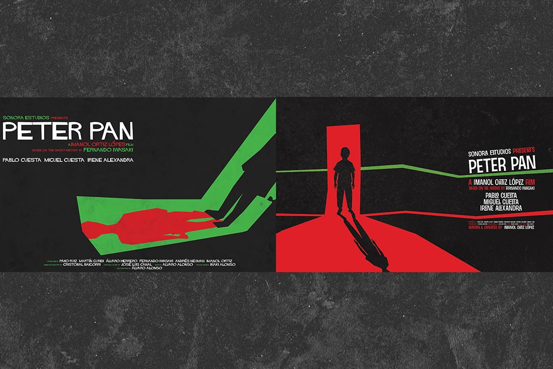
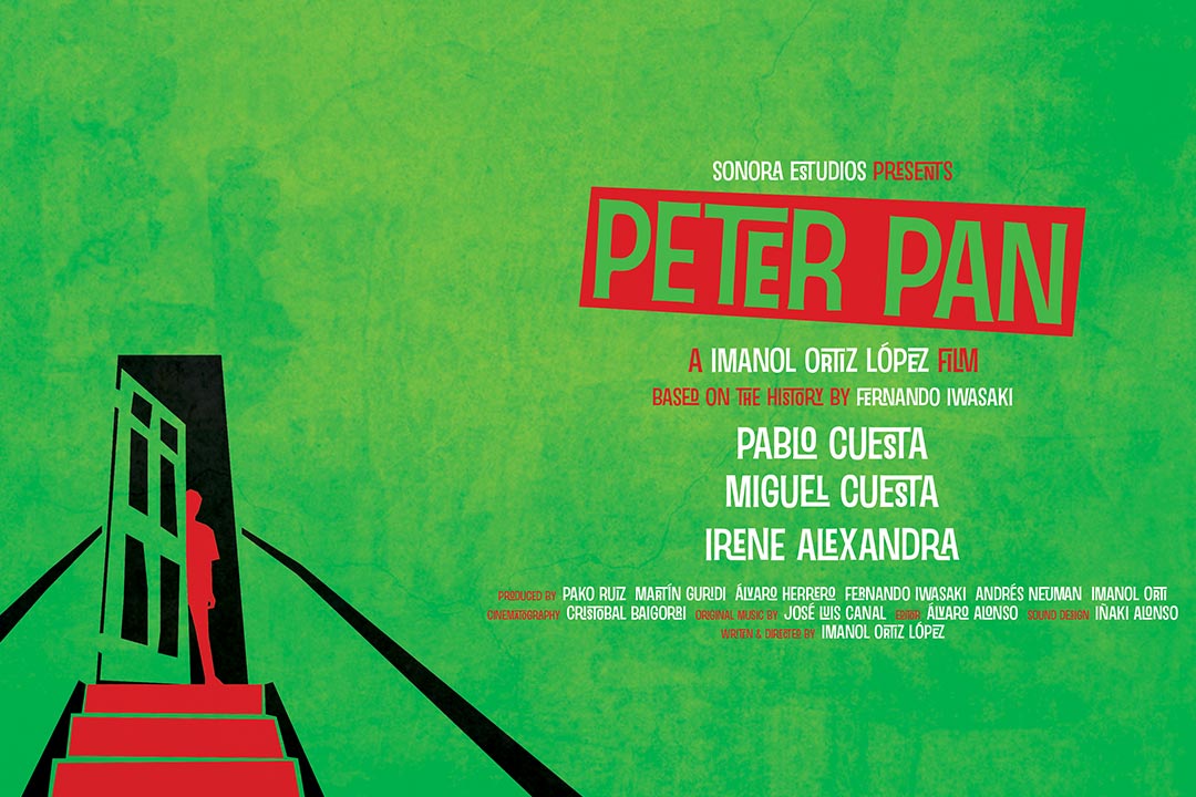
We suggested several ideas and created a selection of designs. The final design was the best that reflected the sinister nature of the film through the image of a slightly opened door with the silhoutte of a boy surrounded by darkness which appears to be on the top floor of an apparment block.
Client:Sonora Estudios
Date:6th, August, 2013
Type:Illustration, Layout & Advertising
Suggested Ideas

Final Poster

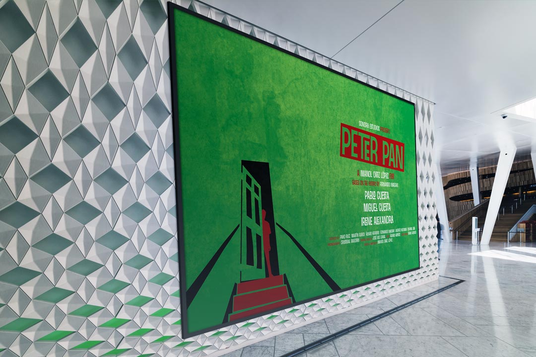
In Display

Typography
Sinzano was used because it's in a Saul Bass style that's perfect for to establish the style required.
To Download Sinzano, please click here

Sinzano: Regular Colours: #FFFFFF, #45B649, #DA1F26
The Design Process
-
Step 1.
Contact with the Client
We first made contact with Sonora Estudios when they discovered our work on Behance, they explained their vision for their upcoming short film called Peter Pan. They required the same illustration style we used for a previous project. They explained how the film is not related to the original Peter Pan story but instead it was a dark a sinister story.
-
Step 2.
Receiving the Brief
While speaking to Sonora via email, they explained thoroughly what the story was about and what style they were aiming for. They asked for the poster to be bold, eye catchy and representative of the storyline. The prime element they wanted to be added was a silhouette of a young child standing in a doorway.
-
Step 3.
Research and Idea Generation
With writing down some notes from our conversation, we went out to research Saul Bass and the movie posters he created during his time as a designer. With this, we gathered knowledge on font styles, colour schemes and ideas on how we could design an attractive movie poster.
-
Step 4.
Client Review
We created 3 potential posters that Sonora could pick one for further development. We added the silhouette of the child as required but used it in different angles depending on the angle we had created. They loved the idea which has a green background and the silhouette of the child being placed at the bottom left that appeared to be looking down a set of stairs.
-
Step 5.
Revised Ideas
The only feedback we received was to change the order, angle, size and colour of the text on the right-hand side as they required the text to take up most of the spare room. To achieve this, we had to re-arrange the text to appear big but not too overpowering as we wanted the illustration of the child not to disappear.
Completed In
1
Hours
Views
550+
Since Realeased
New Films Created
1+
Since Realeased
Client Review
“It was a pleasure working with 2 Corners. They were fast, flexible and very creative. Their proposals always improved the project. I would work with them again without a doubt." Imanol Ortiz López - Director
Show Some Love & Share
Let's Talk
We would love to work with you on your design project. Let’s talk about working together.
Call Us
We would love to talk to you. Give us a call on: +44(0) 7597 137172
Email Us
If you'd like to send us an email, our address is: hello@2corners.net


