The Brief
To produce a brand for a new cupcake start-up in Wembley, England that will help launch the business.
Fluffy Cupcakes came to us with an exciting brief for an industry we haven't worked with before. Fluffy Cupcakes was a new start-up based in Wembley, England that craft their own cupcakes from organic ingredients and they needed our help to launch their new identity along with business collateral and flyers.
Because we haven't worked with any businesses within that industry, were excited and determined to help produce an eye catchy brand and flyers to help boost sales and reputation. We used a font style that has a personal touch while being enclosed within a cupcake wrapper shape.
Client:Fluffy Cupcakes
Date:15th, February, 2016
Type:Branding & Layout
Branding

Business Cards

Flyers

Typography
Pacifico was chosen for it's presonal feel while being legiable and Gotham was with any text that needed a a more professional feel.
To Download Pacifico, please click here
To purchase Gotham, please click here

Pacifico: Regular Colours: #000000, #764695, #E41A18
Gotham: Bold Colours: #000000, #E41A18
The Design Process
-
Step 1.
Contact with the Client
We first made contact with Fluffy Cupcakes when she discovered us on google search results, she explained her vision for starting up a business where she'll have a cupcake stand at Wembley Market selling various handcrafted cupcakes made from organic ingredients.
-
Step 2.
Receiving the Brief
While speaking to Fluffy Cupcakes on the phone, they explained thoroughly what style they were aiming their logo to be. They asked for the logo to be bold, eye catchy and representative of the company. Originally they wanted a rainbow gradient to be used to represent the colourful company and the variety of cupcakes on offer.
-
Step 3.
Research and Idea Generation
With writing down some notes from our conversation, we went out to research existing cupcake brands and what it takes to become a cupcake creator. With this, we gathered knowledge on font styles, colour schemes and ideas on how we could bring out Fluffy Cupcakes from the competition.
-
Step 4.
Client Review
We created 5 potential ideas that in hopes that one would be picked for further development. Originally they asked for a rainbow gradient to be used, unfortunately, the gradient wasn't working so used different colours for different elements that still gives the representation of the different varieties of cupcakes on offer. They loved the idea of the business name in a scripted font that's enclosed in a cupcake wrapper, they only asked if we could include 'Wembley' in there somehow.
-
Step 5.
Revised Ideas
With the feedback, we set out to add the changes and if add a few of our own. We added the requested 'Wembley' underneath the company name in a typewriter style font and added a whisk that follows the curved shape of the cupcake wrapper. We mentioned to keep this as a single colour but you can have different variations e.g. red, orange, yellow etc. But they decided to have the logo in a solid black.
-
Step 6.
Business Cards & Flyers
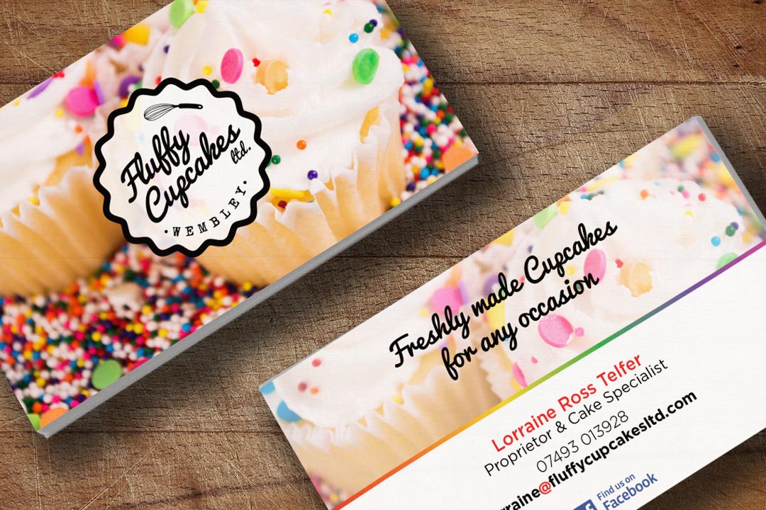
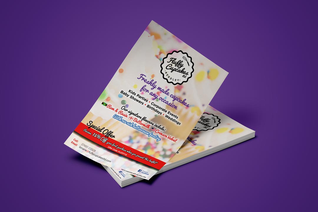
After receiving an approval on the logo, we then set out to design the business cards that would be printed full colour and double sided with a matte finish. When the business cards got the approval to print, we started making a move with designing the flyers that will help promote her business. Originally they wanted them to be double sided but because they'll be handing them out, the majority of people who would look at the back is slim so when the flyer design got the approval to print, we printed them on a paper suitable for flyers in full colour and with a gloss finish.
Completed In
1
Hours
Cupcakes Sold
16950+
Since New Branding
Returning Customers
145+
Since New Branding
Show Some Love & Share
Let's Talk
We would love to work with you on your design project. Let’s talk about working together.
Call Us
We would love to talk to you. Give us a call on: +44(0) 7597 137172
Email Us
If you'd like to send us an email, our address is: hello@2corners.net


